School has been kicking my butt this last week, but I managed to assembly line a few pacters from squad 2 and work out a new paint style. I received some feedback saying the red was too dark, so here's a picture of a brighter style on the far right, old style on the left (everyone else.) Oh, and the newly darkened rocks from the last poll. If you like the new style or old style, go ahead and vote on it. New style is two layers of watered down red and a red GW wash over a black undercoat. Old style is a mud brown basecoat with red worked up on the highlights.

And now, ladies and gentlemen, Pick a Damn Army proudly presents the Mort style tank I ordered one month and one day ago (surprise!):


Those are all the track links. I'm not looking forward to putting them all on.


All the gun barrels are for heavy stubbers, like the Macharius has. I'm glad I won't be using them since they were all snapped off their sprue.

Lower hull standing on its side, sides laid out and turret resting on the main hull.

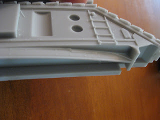
Broken in shipping: a section that will house the road wheels has partially split.

This is what it should look like.

All the fiddly bits. I was very happy to see all the barrels are straight.

The muzzle break is an add on to the regular barrel. I'm impressed with how deep it is and how thin the sides are.

Towards the end of the unpacking I realized several "bits" weren't supposed to be free floating. This bit is supposed to attach just to the right from where it rests, on the outside of the hull to hold a road wheel.

This bit is supposed to be attached like the one in the background.

One flamer lost its igniter and the two curved pieces on the left look official, but I don't know where they belong.

The hatches are a bit smaller than the GW style, as you can see here the GW hatch doesn't fit.

Neither does the tank commander.

If I clip away ring of resin around the bottom of the Forgeworld renegade tank commander, it looks like it will fit.

Ork Trukk for scale. The fiancee loves her orks even though she doesn't play. I really wanted to fix it for her while she was building last night but I didn't. She powered through her frustration (she hasn't built any other models) and it looks great.


The tank is drying off after a scrubbing with a tooth brush and some dish detergent. If shool lets me up for air, I'm really looking forward to building it. My Blood Pact have an AT83 Brigand!
That tank looks pretty mean, really good stuff. I prefer the new, brighter red to the darker red, but they both look pretty good.
ReplyDeleteOne thing though - paint the rims of your bases!
I am still pondering what my AT38s will be. The MORT tanks is tempting but out of my budget, especially with the £/E at an all time low - almost 1 for 1.
ReplyDeleteAre you going to magnetize the weapon options (of the ones that didn't get damaged too much), or build it straight?
ReplyDelete@Gavin: Paint the rim of the bases, check. Brown or black? I'm thinking brown.
ReplyDelete@John: I know what you mean, this was my entire budget for several months. I'm just taking a deep breath and going slow because the Mort tank is a thing of beauty.
@Trent: Magnets all the way. Any tips on where to buy them or how to do it?
Oooh. Can't wait to see this tank all prettied up and defiled. >:)
ReplyDeleteI voted for the brighter red, but I have noticed a trend with red in miniature photographs. It seems like darker reds lose a lot of contrast and become flat in most lighting. Look at Dave Taylor's minis - IMO the red on his guys looks too flat for my tastes, BUT I am also positive that they have much more contrast when seen in real life... I really think it's just the photos.
Likewise, my models tend to show up on film as waaaay too highly contrasty, with really bright reds and dark shadows, when in real life they're not nearly that bright. I know that this is partially due to the post-processing techniques I use (Picasa) to improve my pictures, but I think also partially due to the lighting level in the photos.
So, while I voted for the brighter red, I do also really like the darker red you're using. I just voted for brighter because I suspect it will show up a bit better in photos. If you think the darker red looks better in real life/real light, run with it.
As a side note, I plan to have a friend of mine (who's a professional photographer) take professional pictures of my army when it's completed.